Most photographers believe that composition should be achieved while taking a picture and any cropping done in post processing proves the weakness of proper composition. In most cases I agree with that point of view but in many circumstances we may need to crop a picture.
Most DSLRs produce pictures in 3:2 ratio but not all off photographs are taken with DSLR camera. We must realise that all compact cameras and some of DSLRs use a 4:3 ratio. If we want to present a set of pictures with different ratio e.g. on website, cropping may be necessary to make them look better in picture gallery. When we need to insert our photo into a film made with digital camcorder it will not fit easily because film ratio is usually 16:9. It gets even worse if you need to make a banner for a website like here which by the way originally looks more like this.
[showad block=2]
Sorry, I am a huge fan of Mike Browne and I couldn’t resist making an example of his website. I hope he wouldn’t mind.
As you can see, sometimes we just need to crop our picture.
Because just recently I had to do a lot of adjustments with pictures and film clips to fit different media I came up with some ideas which I would like to share with you.
We all learn different things and techniques by watching other people’s work. We can observe different approach to composition and sometimes use other’s tricks to improve our skills.
Apart from millions of photos and hundreds of photographers present in Internet there is another huge industry making pictures. It is a film industry. We mostly care about action in a movie without thinking that there is a bunch of highly skilled camera operators behind the scene.
Since they operate in wider perspective and have slightly different aims then photographers, their point of view may be quite refreshing.
What do we thing about when we compose our shot:
– find the object
– find a place where it is clearly visible from
– place the object in viewfinder in interesting place ( using rule of third or any other rules we may think of)
– take a technically proper shot ( depth of field, color balance etc. )
It seems obvious to place hole object in frame which is usually easy especially if we remember that shot may be taken either in landscape or portrait orientation.
What if, instead of using our all freedom in manipulation our camera, we make some restriction.
What if we look at a scene like a film makers.
In that case we can only take a picture in landscape orientation. We also need to include some surroundings otherwise our film frame will seem deserted. Let me just point out that this is actually the opposite to what we do when composing a picture where we normally try to exclude unnecessary obstacles.
Before I show you what I mean on some examples let me just make a short comment about all skilled photographers and teachers which presents their examples. They all tend to shot the most meaningless places and locations. And for a good reason. They want us to be focused on techniques rather then on photographed object.
But face the truth. What if I show you a beautiful close up of rose and say that I took this picture visiting London? No Big Ben, no London Eye, no Buckingham Palace. Just a rose which you may find even in your garden…
We go to location and we want to take a picture characteristic for it. But here we get in trouble because the more popular location is, the more photos of it was already taken. And we want ours to be unique and outstanding.
Here is a picture of Kings Castle in Krakow. Probably the most known building in the city.
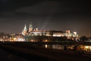
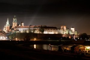
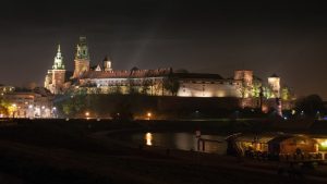
Night shot worked well but an object appear quite small because it is very wide and most of a frame is occupied by sky. After cropping to original ratio it gets bigger but cathedral’s tower, second on left, ends up too close to the border. I could have moved it to the right but then I would crop out the small restaurant on the river which makes a nice point of interest. The 16:9 ratio helped to keep all objects in proper places.
[showad block=2]
Since cropping wide object into wide screen format seems obvious it also work well with some portraits which are typically taken in portrait orientation. Here is an example:

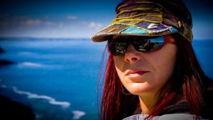
Here the wide format helped to emphasis my reflection in models glasses and because the background is blue it makes it look like a real film frame. As you can see cropping out a top part of her cap works also well here despite the fact that we normally tend to include whole object in frame.
And the last example is a Krakow’s Main Square:
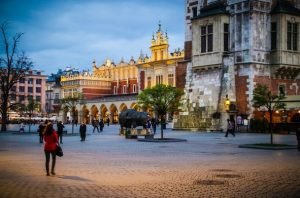
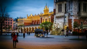
Here I wanted to show a clash of styles which is usually avoided by others.
From left to right: ‘Feniks house’ built in 1930’s, Sukiennice – ( cloth hall)(in the centre) – renaissance building which once was a centre of Polish and international trade and it’s history goes back in centuries and at least Town Hall tower (right).
In that case the normal 2:3 ratio worked well but the panorama-like view of 16:9 makes it even more interesting.
There are obviously many other ways of cropping pictures and many other popular formats. I just wanted to show one of them and perhaps suggest that cropping your photographs to different ratio may be somehow creative.
Chris has been taking photos since he graduated from IT school. First to improve his skills with photo editing software and then it became his hobby.
his gear by now is Pentax k -50 and a few inexpensive lenses and gadgets.
http://www.clickasnap.com/chrisserafin