Amateur photographers usually fixate upon aperture and shutter speed which don’t get me wrong is incredibly important to achieve your desired shot, however many focus so much on their settings that they forget about composition and colour. So here is a beginners guide to using complimentary colour schemes to create impact within your photography.
What is a colour wheel?
A colour wheel is an illustrated diagram that depicts the relationships between primary colours, secondary colours & tertiary colours, and can be a great tool to help you take those amazing shots.
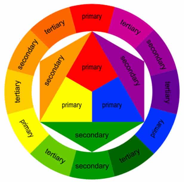
How does it work?
A colour wheel is an easy way to see the relationships between colours. Red, yellow & blue being the primary colours can be mixed to create secondary colours orange, green & violet. Which can then be mixed into what are called tertiary colours: red-orange, yellow-orange, yellow green, blue-green, blue violet, or red-violet.
How to use it in your photos
Finding complementary colours is the easiest way to use the colour wheel to help your photography. For example take the photo below. Look for the colour blue on the colour wheel then look directly across to orange, they are complimentary colours which means the blue sky in the photo and the pale blue of the flood water makes the oranges of the trees and shrubs pop against the background.
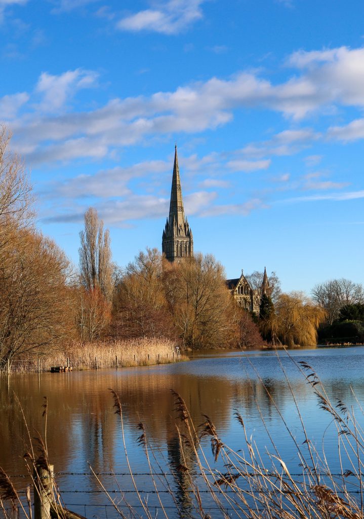
These two colours make for a striking vibrant image which you can find on ClickASnap. We can’t wait to see your shots, get posting on ClickASnap and let us know in the comments below.
Happy Snapping!
.